Wednesday, January 20, 2010

Impression of Kingdom of Style

I apologize for the long wait...school this year has been crazy so far!! I am taking five classes, which include two figure painting courses! Probably doesn't sound very relevant to a fashion blog, but a good foundation in the human figure can only help my fashion drawings in the long run.

One of the first blogs I started reading is, Kingdom of Style(btw does anyone know how to create a link just using the name?) http://kingdomofstyle.typepad.co.uk/
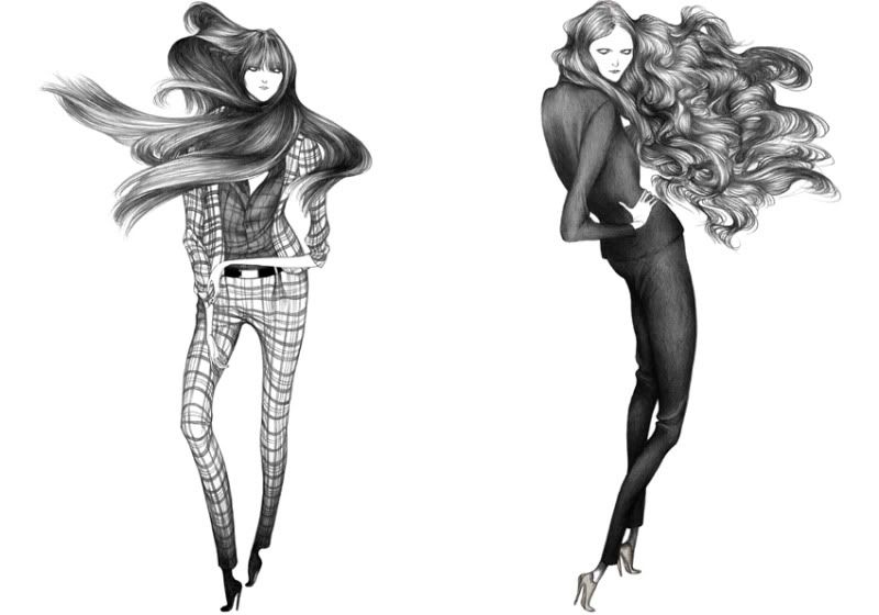
The reason I've kept at it is Queen Michelle continues to inspire through a fantastic combination of outfit posts, new designers, and DIY. I can only dream of pulling off the outfits she comes up with, so for now I'll be content with this sketch I did at the beginning of this month,


Overall I am fairly happy with this, in that I think it conveys a certain mood I was going for, which was a bit of a Gothic, Wuthering Heights feel. It was rather spontaneous, with me finding one of my favorite outfits of Queen Michelle's and going from there(I am kind of creepy in that whenever I find a favorite "image" or "look" I immediately save it on the desktop). The challenge was how to convey a sense of transparency in the skirt, I've never really been successful with it before. I think if I could go back I would have gone for more of a yellow orange rather than so "yellow yellow" that verges on yellow green. But that's the point of these exercises. You learn your mistakes and move forward.

Tuesday, January 12, 2010

Will try to be online soon...Ive still getting into the groove of school, but hopefully will be able to resume fashion sketching shortly!

Wednesday, January 6, 2010

1st post (for me)

Hey I've found time to finally contribute. Rachel asked me if I wanted to start this up with her and it's probably because I borrowed her magazine Lula for way too long and I've asked her many times for fashion advice most recently on which colored oxford heels I should buy. She is way more in the know then I am but I'm slowly getting my head into the fashion world. I've always loved fashion illustration so this will be my attempt to bring something to the table. Here is some work, mostly pen and ink. I'm still trying to figure out a "style" and I'll probably put more color into my work in the future. Woooo!!


Mixed Media

Figures in watercolor

Figure study

Lady Gaga inspired sticker for Ringling Illustration Show

Rachel from behind! How stylish :)

Debbie Harry!

I was trying to put different patterns/ textures on each piece of clothing.


Simple attitude


More recent doodles.


-Kristen

Sunday, January 3, 2010

New Project

What I enjoy most about drawing is the purely gestural, observing information and than interpreting it into a different format.

With that in mind, I've started doing series of drawings based on photographs of my favorite blogs. I feel as though they're great exercises for me in learning how to control pen and ink. And overall I become more comfortable in learning how to play with proportion, color, etc.

I use references because I feel for me, if I am guessing what the gesture will be, I lose a sort of vitality. This is due to me trying to get something "correct". Another aspect for this series is that they overall are quick, and dont usually take more than an hour to two hours to complete. This is to ensure an overall liveliness at the expense of flaws that I will learn from.

My first two are of the Aldridge family which I am sure every Texan who's remotely interested in fashion has heard of. What I love about their blogs is the phenomenal collection of fashion they have amassed, while never coming across as "status obsessed". There is also a great sense of playfulness that I find very inspiring.
http://atlantishome.typepad.com/my_weblog/
http://seaofshoes.typepad.com/


The second image was the quickest, only taking about 45 min to an hour. Often I will either do the whole thing at once. After time has passed I go back and try to look at it with a fresh eye.

The first image (my favorite) was similar except I took multiple breaks while I was working on the texture of the fur. I do like the combination of wash with the heavy line but hindsight is always 20/20.

Let me know if you'd like to see the original reference photos. I am abit too lazy at the moment to go look for them since I did not save the photos after I was done.

Saturday, January 2, 2010

Laura Laine

One feature on this blog that I feel very passionate about is showcasing illustrators that I see as being innovative and stand out from the pack.

An illustrator I only learned about from a MUSE editorial she took part in is Laura Laine. I couldnt find a bio on her website, so from snooping around I gathered that she is a 26 illustrator living in Helsinki.

What I love about her work is a sense of playful-ness created from her use of volume and proportion. Particularly I love her use of value on the form, which creates this fantastic sense of volume on a very distorted(but in a way that suggest she knows what she is doing) form. She seems to do a marker pencil combo which I would first think is a terrible idea really works beautifully together.